With rising wildlife extinction rates rising, I came across various problems faced by the people where the ones who were willing to help and support animals were feeling helpless due to no trustworthy medium to donate and see their impact. As part of my case study, I sought to gain a comprehensive understanding of the issue at hand. I noted that while many charity websites provide a variety of causes to donate towards, only a limited number of them place a specific emphasis on conservationism.
Competitive Analysis
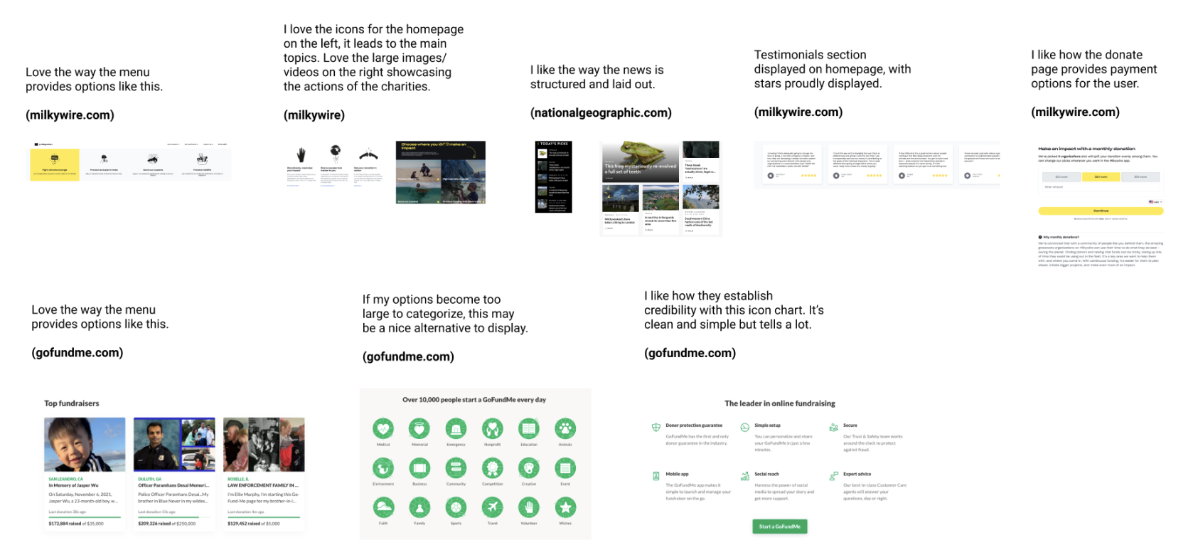
To further explore the landscape of conservation-focused donation websites, I conducted a brief competitive analysis. This involved evaluating and comparing various websites that prioritize conservationism as their core cause. I assessed factors such as website design, user experience, donation process, transparency, and impact reporting. I also examined their branding, messaging, and engagement strategies to gain insights into their approaches in attracting and retaining donors.
To further explore the landscape of conservation-focused donation websites, I conducted a brief competitive analysis. This involved evaluating and comparing various websites that prioritize conservationism as their core cause. I assessed factors such as website design, user experience, donation process, transparency, and impact reporting. I also examined their branding, messaging, and engagement strategies to gain insights into their approaches in attracting and retaining donors.
Process
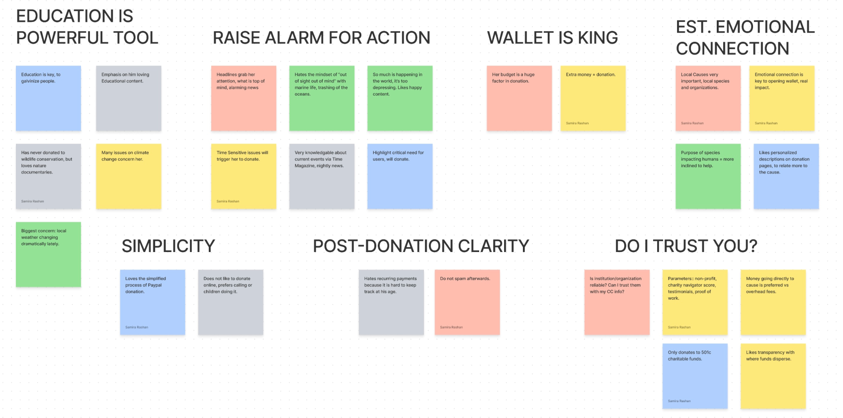
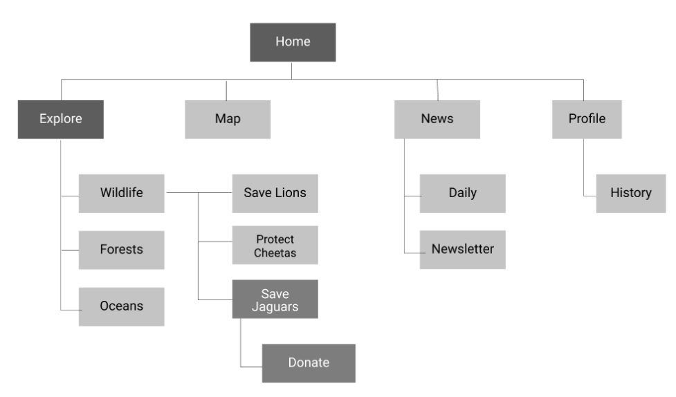
In the initial stages of our UX design process, we initially organized the site based on specific species. However, after gathering valuable user feedback, we made the strategic decision to switch to a more intuitive and user-friendly approach, employing overarching categories: Wildlife, Forests, and Oceans. Within these categories, users can easily find causes related to the topic of their choice and make informed decisions about which organization to donate to. To instill trust and confidence in our users, the app provides comprehensive information about these organizations, ensuring that their donations are in capable and trustworthy hands.
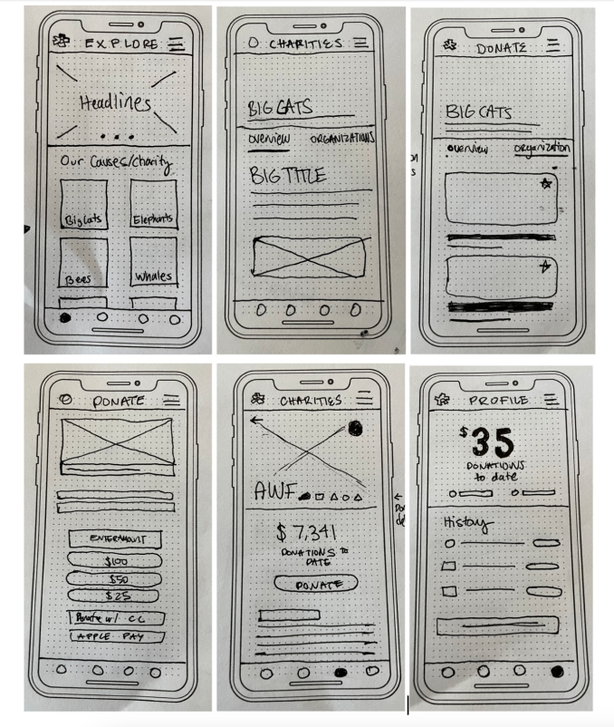
Sketching
During the sketching phase of the UX design process, I focused on creating a clear differentiation between the "overview" screen and the "organization" screen. Through multiple iterations, I explored different interpretations of this interaction to ensure that users could easily grasp the relationship between the two screens. I particularly emphasized the importance of the symbols displayed next to the organization title as they play a critical role in the decision-making process for users. To enhance their visibility and usability, I treated these symbols as a distinct and prominent component in the design.
Wireframing
During the wireframing phase, I adhered to established UI principles, including hierarchy and alignment, to ensure a user-friendly design. To clearly convey the options available to users on the "Organizations" screen, I employed a pattern that grouped related sections together. In terms of typography, I aimed for a clean and distinct sans-serif font, while also considering a font that would add a unique style to the brand. To draw attention to key elements, such as the "Donate" button, I utilized bold formatting to make them more prominent and easily noticeable within the design.
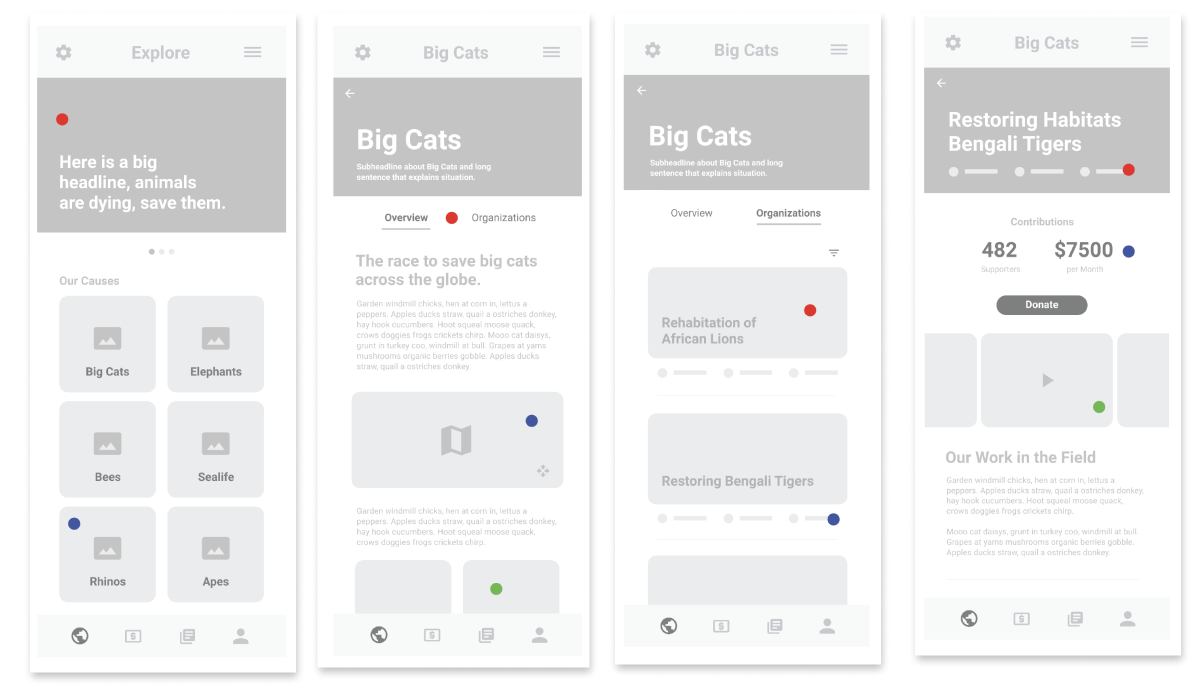
High-Fidelity Prototype
In the final prototype of the app, I made several design choices to enhance the user experience. For example, I curved the rectangular elements to create a welcoming vibe for users. Additionally, I elevated the subheader font from a basic sans-serif to a serious, bold, and futuristic font to convey reliability.
The icons used underneath the organizations and on the organization pages are crucial in providing quick identifiers for users, indicating the charity's status, rating, and other relevant information right from the start. The donation process was designed to be simple and clear, and the prototype includes features such as tracking donation history in the "Profile" section.
Throughout the process of creating this app, I found it to be both rewarding and educational. Striking the right balance between perfecting the UI elements and conducting thorough UX research was a challenging but important aspect of the project.
Expand to view full Prototype